Advanced Typography - Final Project

Nyoman Anita Putri Arimbawa (0339942)
Week 11 - Week 14Advanced Typography - Final Project
Instruction
WEEK 11 (23/06/2020):
Final Project
For our final project, we need to make a font that becomes a solution to a problem, we need to relate it to the area of our intrest
Ideas:
WEEK 12:
Sketches:
I started my sketch by adding a little character like the eye and the mouth
WEEK 13
Second attempt:
 |
| Fig 1.1: Sketch |
First attempt
First, digitalize process.
 |
| Fig 1.2: First attempt |
Second attempt:
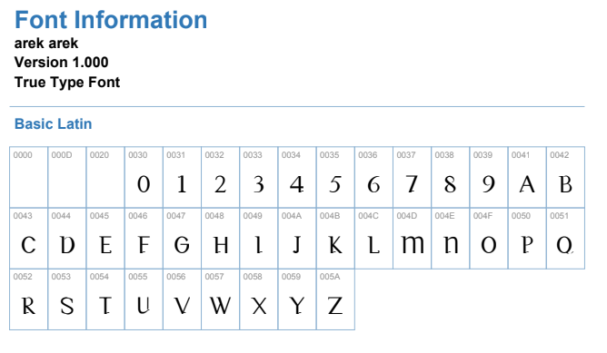
After the feedback session, I realize that adding the character isn't really working and it would be hard to move on with the ideas further in this project. so I decided to remove the character from the letter and just making letters and numbers. I'm referring to the Javanese script and my sketches for the thickness and the stroke
 |
| Fig 1.3: Second attempt |
 |
| Fig 1.4: Second attempt |
After receiving the feedback there is still a lot of error on my font. Mr. Vinod likes my D so I'm going to apply the elements of the D to the rest of the font.
First I fixing the B, R, P that needs the elements from the D
 |
| Fig 1.5: Second attempt VS Third attempt of 'B' |
 |
| Fig 1.6: Second attempt VS Third attempt of 'R' |
 |
| Fig 1.7: Second attempt VS Third attempt of 'P' |
 | |
|
Then, I'm fixing my O, Q, C, G
 |
| Fig 1.9: Second attempt VS Third attempt of 'O' |
 | |
|

Fig 1.11: Second attempt VS Third attempt of 'C'
 |
| Fig 1.12: Second attempt VS Third attempt of 'G' |
After that is W
 |
| Fig 1.13: Second attempt VS Third attempt of 'W' |
 |
| Fig 1.14: Result |
 |
| Fig 1.15: Result |
 |
| Fig 1.16: Latest Result |
I also did numbers,
Process:
 |
| Fig 1.17: Numbers process |
 | |
|
 |
| Fig 1.19: Fontlab Process |
After that, I need to come up with the name, I'm half Javanese and I also use the Javanese script as references for my font. So it's only fitting if I name it something Javanese. The name is "arek" it's a Javanese slang that means people or friends.
 |
| Fig 1.20: Final Font after generated |
 |
| Fig 1.21: Final Font (JPG) |
Fig 1.22: Final Font (PDF)
Application:
Week 14:
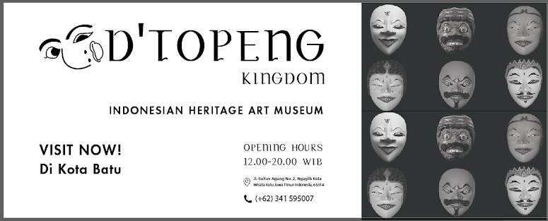
So, my idea is to create a font for the museum of traditional masks in Kota Wisata Batu in East Java, Indonesia. I've been there once and it's really interesting. Its also part of the other museum, which is "Museum Angkut" it's about transportation and the history and the mask museum is called "D'Topeng Kingdom" and I'm going to fix the logo.
 |
| Fig 1.23: Orginal design of d'topeng museum |
 |
| Fig 1.24: Orginal design of d'topeng museum |
 |
| Fig 1.25: redesign of d'topeng museum |
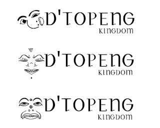 |
| Fig 1.26: redesign of d'topeng museum (different option) |
 |
| Fig 1.27: Final design of d'topeng museum |
Then I decided the first one is the most fitting. After that, I'm making the collaterals.
Collaterals:
First, I'm making the poster for the billboard
Process:
 |
| Fig 1.27: First attempt |
 |
| Fig 1.28: Final attempt |
 |
| Fig 1.29: Final attempt (colored) (JPEG) |
Then I put it as a billboard:
 | |
|
Other Collateral:
T-shirts:
 | ||
|
 |
| Fig 1.32: D'topeng Cups (JPEG) |
 |
| Fig 1.33: D'topeng pop-socket (JPEG) |
Ticket:
 | |
|
Wristband:

 |
| Fig 1.36: D'topeng wristband (JPEG) |
Wall-mounted sign:
 |
| Fig 1.37: D'topeng Wall-mounted sign (JPEG) |
Flatlay:
 |
| Fig 1.38: Flatlay. (JPEG) |
| Fig 1.39: Flatlay. (PDF) |
Feedback:
General Feedback: The amount of time we had to work on this project is very limited.
Specific Feedback: The ideas seem possible
Week 12: Specific Feedback: Mr. Vinod says don't think so, still need a lot of work, I should go back to the sketches to figuring out the thick and thin stroke I should work fast and smart
Week 13: Generic feedback: don't use an existing typeface
Specific feedback: Be careful with the joint like in the letter d and r W doesn't work, need to take consideration on the where to put the shape
Still a lot of nuances
Focus on the crafting, the weight, and the stroke
Still a lot of nuances
Focus on the crafting, the weight, and the stroke
The way I've done the smoothness of the d needs to be applied to the B, R, and K (too rounded) G and C is not happening
D e f h t x and a are the good letters k almost there except for the leg
Week 14: Mr. Vinod said that I did a really good job
Finding: Week 13: If an idea doesn't work is better to find an alternative in a short time as possible, we might have a great Ideas in our head, but when it comes to the execution part that it is not working it's better to move on then finding ourself stuck in that place. It kinda sucks and coming up with an idea is hard enough but we can't let ourselves stuck in the past. Week 14: I'm disbelief at the other peers that already finish their work so early, part of me is saying "wow that's must be nice, I should've work faster" but as I personally, I can't really rush my work.


Week 14: Mr. Vinod said that I did a really good job
Reflection
Experience: Week 11: I felt really blank coming with ideas and quite worries because the proposal is the most crucial part of the project and if we couldn't comes out with a good idea moving on going to be a problem. Week 12: For this project, it's solely on us and the lectures are letting us loose so this is the real test. Week 13: The weeks through the ends is getting more and more stressful and pressuring, I'm just glad that this week I make a major improvement for my uppercase letters. Week 14: I'm disbelief at the other peers that already finish their work so early, part of me is saying "wow that's must be nice, I should've work faster" but as I personally, I can't really rush my work. Week 14: I got sick, probably all the stress and the sleepless night finally catching up. I just really want to sleep at this point.
Observation: Week 11: This project really makes me observe everything around me that is typographic related, I was hoping that I found something that is needed to be resolved, there are some that I found that could be work on, like the address numbers in my neighborhood and prescription writing in medicine, etc. Week 12: I kinda get used of the online class after 12 weeks but, it such a big temptation not to jump in bed and sleep (or just fell asleep in general) or just walk around the room, there are actually many cases that I see where people are not there when they were called and the lecture just assume that they walk around. Week 13: I'm surprised that I have 0 absent in this class, seems that the class are getting smaller and there are lesser people joining the class, I really hope that everyone is safe and sound. Week 14: The number of participants in this class is decreasing a lot, wondering is everyone ok or not.
Finding: Week 13: If an idea doesn't work is better to find an alternative in a short time as possible, we might have a great Ideas in our head, but when it comes to the execution part that it is not working it's better to move on then finding ourself stuck in that place. It kinda sucks and coming up with an idea is hard enough but we can't let ourselves stuck in the past. Week 14: I'm disbelief at the other peers that already finish their work so early, part of me is saying "wow that's must be nice, I should've work faster" but as I personally, I can't really rush my work.
Week 14: I got sick, probably all the stress and the sleepless night finally catching up.
Design Elements, Typography Fundamentals:
Further reading:
I need to read about Indonesian traditional mask:
There are 10 most iconic traditional mask character in Indonesia and each of them has their own story:
the most popular are; Topeng Panji, Topeng Pamindo, Topeng Tumenggung, Topeng Kelana, Topeng Rumyang, Topeng Prabu Asmoro Bangun.
From this book, I found the refreshment I need to do this project:
Glyphs comprise all marks in a typeface from letterforms and numerals to punctuation and symbols.
A character is a typographic element such as a letterform, numeral, or punctuation mark.
What's really helpful for me is the kerning information. Kerning adjusts the slivers of space between characters. Such fixes are common with letterforms next to T, V, W, and Y. Delicate shifts were closer to or farther from one another remedy awkward character combinations.


Comments
Post a Comment