Week 5-Week 6 (25/09/19-2/10/19)
Nyoman Anita Putri Arimbawa (0339942)
Project 1-Editorial Text
1. Lecture
Lecture 5:
week 5 (25/09/19)
no lecture was given we have to focus on our project one.
week 6 (2/10/19)
no lecture was given we have to focus on our project one.
2. Instruction
Project 1
During week 4 Mr. Vinod gives us a long guide to doing the project.
First, we have to pick n article that already given to us, we have to read the article and choose the right typeface for the article we have to pick the 9 type family that is given to us.
After reading the article that was given to us, I pick The Impact of Bauhaus on Modern Culture, after reading the article, I was exploring the 9 type family that was given to use to decide which one, suited the most for the article.
Before starting the project I rewatch the video of Mr. Vinods showing us examples of how to do this project, then I go to youtube and watch a few youtube videos on how to use Indesign for typography, tips on how to arrange a paragraph, how to justified text in Indesign, and many more. Then I go online to find some inspiration, I search on magazine design and newspaper design,
 |
| Fig 5.1: References |
 |
| Fig 5.2: References |
 |
| Fig 5.3: References |
 |
| Fig 5.4: References |
Then I also go to some website to learn more about Indesign,
 |
| Fig 5.5 |
I proceed to make my project, first I make a new document on Adobe Indesign, and use the layout that is given to use from Mr. Vinod, but I make mine 3 column instead of four.
 |
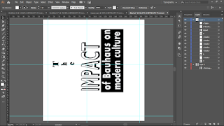
| Fig 5.6: The impact of Bauhaus on modern culture |
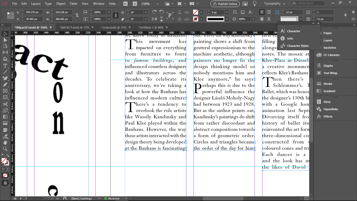
Then I copied all the text as one, as Mr. Vinod that the only way you should do it so that none of the text got accidentally got deleted,
For this article, I decided to choose sefira std for my body of text Sefira STD, and the type size is 9 pt, it's not too big or too small and as for my paragraph, I choose to justify my text to the left.
 |
| Fig 5.7: The impact of Bauhaus on modern culture: Process Project One |
After making my body of text, I begin to work on the leading text, I pick Futura Std, I wanted to make the 100 really stood out, cause I want to make the anniversary of the 100 years of the Bauhaus really feel like it celebrated so I increase the type size to make it larger.
 |
| Fig 5.8: The impact of Bauhaus on modern culture: Making heading |
Ater Moving on to the headline, I really want to emphasize the word "Impact", so I pick a different font that is Gillsan light shadowed,
 |
| Fig 5.9: The impact of Bauhaus on modern culture: Making Heading |
After removing the columns and the grid, I realize that the pages aren't really balanced there still a lot of white space at the bottom of the body of the text. then I make my body of text kinda looks like a stair.
 |
| Fig 5.10: The impact of Bauhaus on modern culture: Finishing touches |
 |
| Fig 5.11: The impact of Bauhaus on modern culture: Draft 1 |
Then I continuous by making a different style of the same text.
 |
| Fig 5.12: The impact of Bauhaus on modern culture: second attempt |
For this time, I want to make my column to be 4,
 |
| Fig 5.13: The impact of Bauhaus on modern culture: Adding justify |
For this, I want to make my paragraph to have kinda represented a building so I choose to fully justify my text
 |
| Fig 5.14: The impact of Bauhaus on modern culture: Making the body of text |
 |
| Fig 5.15: The impact of Bauhaus on modern culture: Making the body of text |
 |
| Fig5.16: The impact of Bauhaus on modern culture: Making heading in illustrator |
Mr. Vinod allowed us to make or headline in Abobe Illustrator.
 |
| Fig5.17: The impact of Bauhaus on modern culture: Making heading in illustrator |
 |
| Fig5.18: The impact of Bauhaus on modern culture: Making heading in illustrator |
 |
| Fig5.19: The impact of Bauhaus on modern culture: Making heading in illustrator |
After making my headline, I did more research on the reading
 |
| Fig 5.20: Editorial Text: Research |
 |
| Fig 5.21: Editorial Text: Research |
 |
| Fig 5.22: Editorial Text: Research |
After I did my searching, most of the thing that Bauhaus influenced is a building, then I go back to illustrator and make a different headline,
 |
| Fig 5.23: Editorial Text: Making Headline in Illustrator |
 |
| Fig 5.24: Editorial Text: Making Headline in Illustrator |
 |
| Fig 5.25: Editorial Text: Making Headline in Illustrator |
 |
| Fig 5.26: Editorial Text: Making Headline in Illustrator |
I make my headline as it is a building from a 2 point perspective
 |
| Fig 5.2: Making Headline in Illustrator |
then I proceed to put my headline in my Indesign page,
 |
| Fig 5.28: Editorial Text: Placing Headline |
 |
| Fig 5.29: Editorial Text: Highlighting the text |
For highlighting some text I use italic.
 |
| Fig 5.30: Editorial Text: Positioning body of text |
After removing my margins and column is saw that my pages are not balanced, and I want to make my body of text to seems like a silhouette of a building,
 |
| Fig 5.31: Editorial Text: |
I decided to tilt my body of text 90 degrees and then out my leading text above my body of the text.
 |
| Fig 5.32: Editorial Text: Second attempt result |
I also want to try a different article, because Mr. Vinod said it will be better if we had multiple works because he gave us an extended time to work for this project, so then I decided to choose a different article and I pick The designer's code of ethics
 |
| Fig 5.34: Editorial Text: Third attempt |
 |
| Fig 5.35: Editorial Text: Making headline |
 |
| Fig 5.36: Editorial text |
week 6:
In week 6, we have to finalize our work, after showing my work to Mr. Vinod he right away picks the one I showed (fig 5.11), he told me a few things to fix it, he said that the position of my the text is kinda awkward, so he told me to fix that.
 |
Fig 6.1: Editorial Text: Print
|
Then Mr. Vinod told the whole class to print their work, and be ready to be revised for the last time, after I shows my printed work , both Mr. Shamsul and Mr Vinod is not a big fan of the emphasize 100 cause its contradict with the word impact and they also don't like the indent I make, as my highlighted text they want me to just make it just italic and without grey because they couldn't see it clearly.
 |
| Fig 6.2: Editorial text |
Feedback
week 5:
General Feedback: In project one all body of the text must be connected, why we must do this because the change of missing a sentence or a word is very high if we connect it all together the change of it getting missing is lesser. If we want to use indentations for our paragraph, it shouldn't have spacing and its best to justify the text. Specific feedback: All of the body text should have the same typefaces so it will seem like the same article.
week 6:
General Feedback: Make sure that we have a mouse, Mr Vinod said again to make sure that our body of text is connected, specific feedback: When I showed Mr. Vinod and Mr. Shamsul my work of project one, first thing they said is why the "100" so big then I explain that I want to make a 100 years anniversary really feel celebrated they said alright, then they proceed to look at my body of text, they said the position of my body of text is kinda Awkward, they told me to reposition it and my leading text as well to make it nicer and he suggests to make it like a text.
After I print my chosen word by Mr. Vinod, I ask both lecturers for a final revision, they to remove the indent of my paragraph and for the highlighted text to make it black cause they couldn't really see it and just make it Italic, they also said to make the 100 smaller
Reflection
Experience:
week 5: This week, For this first project I really struggling with making the layout, It was my first time using Indesign, I never before design a paragraph with a quite long body of the text, I wasn't able to finish my work for the project and as result to that I have so much mistake that I have fix. Week 6: I did a few mistakes during working on the project but slowly I'm learning and making progress though I still and will make a mistake I have to make sure to learn from that mistake and not make the same mistake again.
Observation:
week 5: As I started this project, I really get confused at what we should do cause I still having trouble following the lecturer and also people in the class, I see some few people also facing the same thing as I did, I should've listened o the lecturer more and focused more on what they said. Week 6: As I learned from last week mistake, I get better ideas on what is a good text and how important it is on what we were doing on this project, there is a really crucial thing on editing text especially if its a client text, and also not only for the sake of the client but for the sake of the reader to.
Finding:
week 5: I realize that how important it is to managing time cause we never get enough of, it is a really valuable thing and we have to make sure that we didn't waste any of it. Week 6: I found how important is to able to receive feedback is, no matter how "harsh" the feedback could be, I have to learn to be a good listener when a feedback is given, and also to show good behavior, and also to shows an appreciation on the feedback regardless of the type of feedback that I got, at the end of the day, the feedback is what I really need to improve my self and to fix the mistake that gets passed through my eyes and as well as to not afraid to ask some question on the work.
Further Reading
Since I'm new to InDesign, so I decided to skim through this book. In this book there is information about InDesign, especially for designing a text, working with text and there are many shortcuts. unfortunately, this book is using the older version of InDesign, there are a few differences in the InDesign that I use compared to the InDesign that the book using so there are things I couldn't follow.

According to the book, there is environmental typography needs to consider while working with type. The design of the lettering for the built environment has historically drawn upon different traditions, skills, and media. as example typography in architecture needs to function effectively at scale has to be readable from a range and distance, it must be able to communicate for the pedestrian or the motorist according to their viewpoint. The designer needs to consider the action id light and the manner in which the letters interact with the building materials, this may include few possibilities like, three-dimensional or illuminated signage.
Other examples are informational signage, it may not be a matter of the design aesthetics but its a matter of life and death, like information on the highway, at the hospital, and airport may be crucial to safety.


Comments
Post a Comment