Week 10-Week 13( 30/11/19-13/11/19)
Nyoman Anita Putri Arimbawa (0339942)
Final Project
Lecture
Week 10
There are no lecture for this week, we have finalized our second and also working on the first part on our final project
Week 11
There are no lecture this week we have to focus on our final project
Week 12
There are no lecture this week we have to focus on our final project
Instruction
Final Project
Week 10:
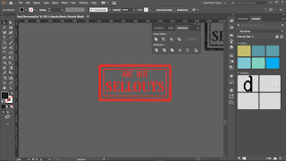
Before this week's class, Mr. Vinod told us in the facebook group to bring a broomstick and also board, We need to make a manifesto line about design and society. I have a few sentences that I come out with such as, MY DESIGN MY PRIVILEDGE, DESIGN HAS TO please, MAY A GOOD DESIGN PLEASED YOU, YOUR STYLE IS SHIT AND I LOVE IT and DESIGNER ARE NOT SELLOUT, LOOKUP FOR DESIGN, NOTHING SAYS FREEDOM THEN DESIGN. At the class, I showed my ideas to Mr. Vinods the one that says sellout but he said to change it to sellout designers are not, then I begin with my manifesto line sketches.
 |
| Fig 10.1: making sketches for the manifesto line |
 |
| Fig 10.2: making sketches for the manifesto line |
 |
| Fig 10.3: making sketches for the manifesto line |
 |
| Fig 10.4: making sketches for the manifesto line |
 |
| Fig 10.5: making sketches for the manifesto line |
After we got the approved the sketches by the lecturers we begin to make the manifesto board
Today's class was about a brief about our updated version of the final project.
We must express our word that is from our manifesto line and digitalize it using Adobe Illustrator using the 9 typefaces that are given to us at the beginning of our semester, then find the right font to choose that is appropriate for our expression on our manifesto line.
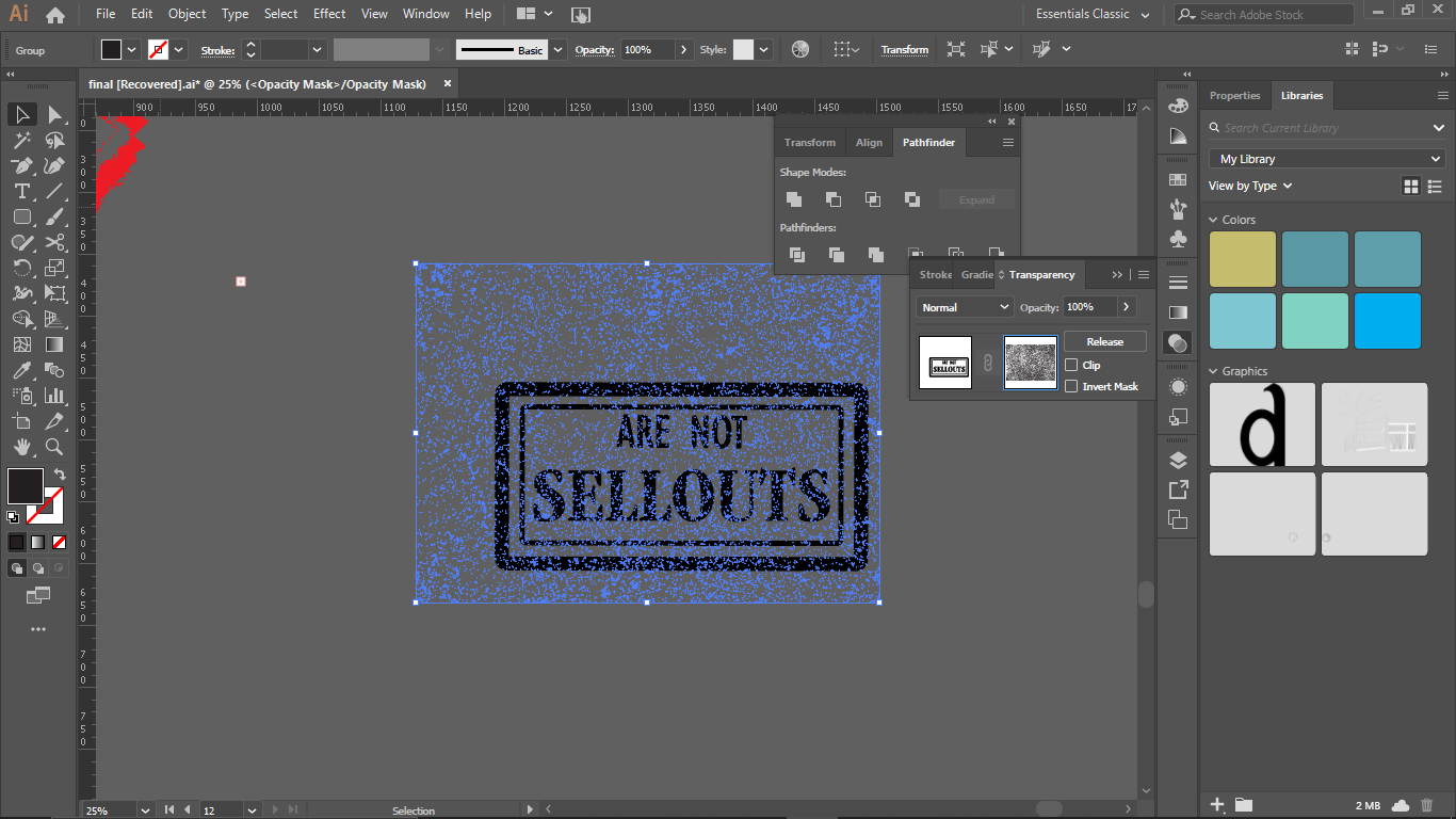
Then I begin on making the animation but Mr. Shamsul said my stamp isn't stamp-like, so I need to fix it.
 |
| Fig 12.5: Making a stamp. |
So I decided to watch a tutorial on how to make a stamped texture on adobe illustrator. I create a new design for my stamp.
 |
| Fig 12.6: combining the object. |
After making the design, I have to make sure that I sure the text into a path and merge all the text into one object.
 |
| Fig 12.7: Making a stamp |
 |
| Fig 12.8: Making a stamp |
Then I have to make my object to black and go to the transparency make a mask layer
 |
| Fig 12.9: adding a vector |
then I have to search for a free vector for a stamped texture then downloaded it. then I make a path on the vector and copy it and paste it on and created a mask on it.
 |
| Fig 12.10: Making a mask |
Then I make a mask layer on that vector.
 |
| Fig 12.11: Making a mask |
Then I added more until I feel it looks like a stamp.
 |
| Fig 12.12: Making a mask |
 |
| Fig 12.13: finishing stamp. |
Then I change it to the color red.
 |
| Fig 12.14: Change color. |
And I added to my design.
 |
| Fig 12.15: Typography expression. |
Then the next step of this project is to make an animation of the design that we made.
 |
| Fig 12.16: Making animation on Illustrator |
I tried making the animation in Adobe Illustrator.
 |
| Fig 12.17: Creating the animation |
After that, I make the animation on the photoshop
 |
| Fig 12.17: The first trial on the animation. |
I decided to do a little adjustment on my design project.
 |
| Fig 12.18: Design. |
after further consulting with Mr. Vinod and Mr. Shamsul, they said the border I made is unnecessary so I have to remove it and because there are some changes to the design I made so I need to redo my animation
 |
| Fig 12.19: Adjusting typography expression |
 |
Fig 12. 19: Typography expression
|
 |
| Fig 12.2: Final project animation |
Feedback
Week 10:
General FeedBack: In our a4 god is in the kerning sentence should be in the same point size, and our label should be in Helvetica or Arial in 7 points. Specific feedback: After showed Mr. Vinod my 'god is in the kerning sentences', they told to fix my s and k because the thickness is different from the other letter. For my sentences for the final project, Mr. Vinod said my line is good but he said I should make it into sellout designers are not instead of designers are not sellout.
Week 11:
General Feedback: If we want to check our block we have to make sure that we checked it in a private browser or if we using chrome use incognito so that we can see what file that is not private. For our project two a4 files we must make sure that we use all the space to display the project. specific feedbacks: Mr. Vinod said that I pick an appropriate typeface for my
Sellouts word and he also added that it should be sellout not sell out so if it is on different line it should have hyphenation and also it should be sellouts because designers are plural
Week 12:
General Feedback: We should use the knowledge of typography that we have learned into the poster design like adjusting tracking, kerning, letterspacing. We have to make sure that our A3 files are changed to a4 when we animate it or else our whole system will crash. When buying the frame for our printed a3 files we must have the right frame from IKEA and also the right size. Specific feedback: Mr. Vinod said that I should makes the background into white instead of my type and change my type into black and make my object looks more stamp-like.
Reflection
Week 10: I was really confused when I received the notification from Mr.Vinod on the facebook groups, I have no ideas on what manifesto about designers and society I have to make, finding inspiration by doing a research about design and society it helps. Week 11: For this week instruction we have to make a design and choose the right typeface to express the feeling of the manifesto, I'm still having an issue to express the emotion through type, still confused on how to pick the right typeface that is appropriating the emotion Week 12: I still couldn't believe that the semester nearly over, and the learning and the knowledge that we received all will determine for this final project, it was quite nerve-wracking and makes me quite nervous and all I can do is do all I can, gives my best effort fort this final project.
Observation:
Week 10: It was some sort inspiring when I come to class and ask around on what manifesto lines about designers and society, some have really motivational quotes and it's quite exciting seeing peoples in the class also so pumped about this project. Week 11: When I begin to digitalize my manifesto in illustrator its actually a lot harder then doing it traditionally on a paper, though it will give the design more consistency on the overall design, and people in the class seem to find trouble with that Week 12: I come in class this with some ideas and it makes me nervous about what the lecture would think about the ideas that I comes out with plus this is the final project and everything that we did throughout this module is will reflect on the final project.
Finding
Week 10: I found that putting a giant board on a broomstick is hard af, it took a few hands and a tones of glue gun, kinda wondering what do people in a real protest use to make their protest sign be strong enough to be able to go through all the shaking movement going up and down and brutally being swinging it around, but still be able to last on that stick, and it stays on the board and just thinking if a designer makes a protest sign would they do the same thing. Week 11: Although the lines is the same but trying to digitalize it is quite a challenge, cause i kinda worried if will i be able express the lines I make and digitalize and its still will have the same feeling that I intend to express Week 12: Came to this class was real concern, as also for some people I know in this class, I'm just really hoping that the lecturers will approve one of my ideas, and through the feedback session I did get the approval, although I found that because entierly expressing the lines only by choosing the right typeface is hard and finding the one that is suitable and appropriate for the expression is definitely a challenge something that I need to do more research on, its hard not to rely on a few illustrations to express more of the feels on it but its better to find the right typeface and make the typeface shows through.
Further Reading
Typographic legibility is widely misunderstood and often neglected
by designers. Yet it is a subject that requires careful study and
constant evaluation. Legibility is achieved by controlling the qualities
and attributes inherent in typography that make type readable. These
attributes make it possible for a reader to comprehend typographic
forms with the least amount of difficulty.
Typographers and designers have a definite responsibility to their
readers to communicate as clearly and appropriately as possible.
This responsibility is suggested by Henry David Thoreau in Walden:
“A written word is the choicest of relics. It is something at once more
intimate with us and more universal than any other work of art.”


Comments
Post a Comment