Advanced Typography
Nyoman Anita Putri Arimbawa (0339942)
Advance Typography - Exercises
LECTURE
Week 1 :
First online class, Mr. Vinod did a Facebook Live, he started by discussing the MIB and briefed about the module. After that, we moved on to learning about the
typographic system.
Mr. Vinod shows us the book by Kimberly Elam that shows all the definition and an explanation of the typographical system. According to this book
- Axial: All elements are either to the left or right of a single axis
 |
| Fig. 1.1: Axial System |
- Radial: All elements extend from a point of focus
 |
| Fig. 1.2: Radial System |
- Dilatational: All elements extend from a central point in a circular fashion
 |
| Fig. 1.3: Dilatational System |
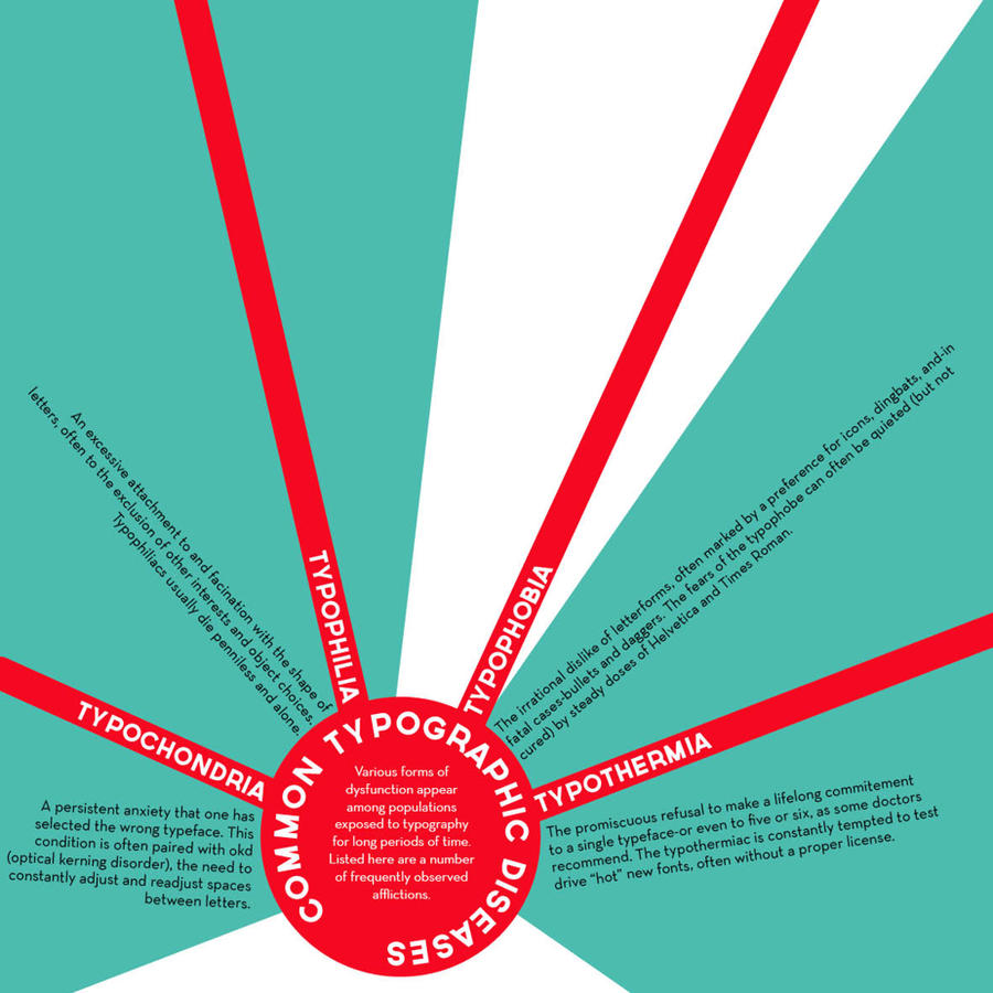
- Random: Elements seem to have no specific pattern or relationship
 |
| Fig. 1.4: Random System |
- Grid: A system of vertical and horizontal divisions:
 |
| Fig. 1.5: Grid System |
- Transitional: An informational system of layered banding
 |
| Fig. 1.6: Transitional System |
- Modular: A series of non-objective elements that are constructed as standardized units
 |
| Fig. 1.7: Bilateral System |
- Bilateral: All text is arranged symmetrically on a single axis
 |
| Fig. 1.8: Modular System |
I write a few notes during the lecture
 |
| Fig, 1.9: Notes |
 |
| Fig, 1.10: Notes |
and what Mr. Vinod really further explains is the modular system because many seem likely to mistake it with the grid there are a few important differences between the two.
 |
| Fig, 1.11: Mr. Vinod's FB live |
After that Mr. Vinod ask us to move on to the meeting in ZOOM to get us familiar with the app and he also gives us more examples on the exercise
 |
| Fig, 1.12: Ad,Typo Zoom meeting |
WEEK 2
Typographic Composition:
There are a few typography composition
emphasis, isolation, repetition, symmetry and asymmetry, alignment, perspective etc
Emphasis: Making a dominance
The rule of thirds: mostly to use in photograph guides to place a point of interest, but n a layout it's just to make sure that the information doesn't exceed the layout
WEEK 3
INSTRUCTION
Exercises
Week 1:
We were given a few texts to work on in Indesign we meet to add the typographical system.
There are :
- Axial
- Radial
- Dilatational
- Random
- Grid
- Modular
- Transitional
- Bilateral
content:
The Design School,
Taylor’s University
All Ripped Up: Punk Influences on Design
or
The ABCs of Bauhaus Design Theory
or
Russian Constructivism and Graphic Design
Open Public Lectures:
November 24, 2020
Lew Pik Svonn, 9AM-10AM
Ezrena Mohd., 10AM-11AM
Suzy Sulaiman, 11AM-12PM
November 25, 2020
Muthu Neduraman, 9AM-10AM
Fahmi Reza, 10AM-11AM
Fahmi Fadzil, 11AM-12PM
Lecture Theatre 12
Process:
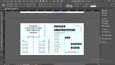
First, we need to make the layout of the page we need a 200x200mm in Indesign and we make the margins.
After that, I did a few sketches of the layout
 |
| Fig. 1.1: sketches |
 |
| Fig. 1.2: sketches |
Then I moved to Indesign, the typefaces that I pick is Futura and gill san
AXIAL SYSTEM
 |
| Fig 1.3: Process |
 |
| Fig 1.4: Process |
RADIAL SYSTEM
 |
| Fig 1.5: Process |
 |
| Fig 1.6: Process |
DILATATIONAL SYSTEM
 |
| Fig 1.7: Process |
 |
| Fig 1.8: Process |
BILATERAL SYSTEM
 |
| Fig 1.9: Process |
GRID SYSTEM
 |
| Fig 1.10: Process |
MODULAR SYSTEM
 |
| Fig 1.11: Process |
TRANSITIONAL SYSTEM
 |
| Fig 1.12: Process |
 |
| Fig 1.13: Process |
RANDOM SYSTEM
 |
| Fig 1.14: Process |
First Attempt Result:
 |
| Fig 1.15: AXIAL SYSTEM(FIRST ATTEMPT) |
 |
| Fig 1.16: RADIAL SYSTEM (first attempt) |
 |
| Fig 1.17: BILATERAL SYSTEM (first attempt) |
 |
| Fig 1.18: DILATATIONAL SYSTEM (first attempt) |
 |
| Fig 1.19: GRID SYSTEM(first attempt) |
 |
| Fig 1.20: MODULAR SYSTEM (first attempt) |
 |
Fig 1.21: TRANSITIONAL SYSTEM (first attempt)
|
 |
| Fig 1.22: RANDOM SYSTEM (first attempt) |
Second Attempt:
 |
Fig 1.23: AXIAL SYSTEM(second attempt)
|
|
 |
Fig 1.24: DILATATIONAL SYSTEM (second attempt)
|
 |
| Fig 1.25: RADIAL SYSTEM (second attempt) |
|
 |
| Fig 1.26: BILATERAL SYSTEM (second attempt) |
|
 |
| Fig 1.27: GRID SYSTEM(Second attempt) |
|
 |
| Fig 1.28: MODULAR SYSTEM (Second attempt) |
|
 |
Fig 1.29: TRANSITIONAL SYSTEM (Second attempt)
|
 |
Fig 1.30: RANDOM SYSTEM (Second attempt)
|
|
Third attempt:
 |
Fig 1.31: AXIAL SYSTEM(third attempt)
|
 |
Fig 1.32: RADIAL SYSTEM (third attempt)
|
 |
| Fig 1.33: BILATERAL SYSTEM (third attempt) |
 |
| Fig 1.3:4 DILATATIONAL SYSTEM (third attempt) |
|
 |
| Fig 1.35: GRID SYSTEM(third attempt) |
|
 |
| Fig 1.3:6 MODULAR SYSTEM(third attempt) |
 |
| Fig 1.37: TRANSITIONAL SYSTEM (third attempt) |
 |
| Fig 1.38: RANDOM SYSTEM (third attempt) |
Fig 1.39: Typography system (pdf)
Exercises 2: Type and play
Part 1
deconstruct an image of an object/area then find a line or flow that represent a letter which we will then refine by creating consistency through the shapes found and using an existing typeface to use as a reference
Process
 |
| Fig 2.1: Image chose (broken mirror) |
 |
| Fig 2.2: Line enhanced |
 |
| Fig 2.2: Finding letters |
 |
| Fig 2.3: Letters found |
 |
| Fig 2.4: First formed letters |
Then I begin to use Futura Book as my references to refine the letters
 |
| Fig 2.5: First refinement |
Comparison:
 |
| Fig 2.6: First |
 |
| Fig 2.7: Second |
 |
| Fig 2.8: Third |
 |
| Fig 2.9: Final |
 |
| Fig 2.10: Letter A |
 |
| Fig 2.11: Letter Y |
 |
| Fig 2.12: Letter L |
 |
| Fig 2.13: Letter V |
 |
| Fig 2.14: Letter K |
Part 2: Type & image – An image of a man-made structure or object and nature will be combined with a letter/word/sentence. The objective is to enhance/support the interplay between the letter/word/sentence and the selected image. The text must be woven into a symbiotic relationship with the image.
Process:
First attempt:
The Ideas is to add the word glow on her cheek.
 |
| Fig 4.1: Picture chosen |
 |
| Fig 4.2: Process |
 |
| Fig 4.3: First attempt result |
Second attempt
 |
| Fig 4.4: Picture chosen |
 |
| Fig 4.5: Picture chosen |
 |
| Fig 4.6: Process |
 |
| Fig 4.6: Process |
 |
| Fig 4.7: result |
 |
| Fig 4.8: result |
Third attempt:
The words I choose for this one is Under the Deep Sea or Deep under the sea, whichever makes sense haha,
 |
| Fig 4.9: Picture chosen |
Process:
 |
| Fig 4.10: Process |
 |
| Fig 4.11: Process (adjusting color) |
I feel like the color is too green, i don't hate it ut kinda wanna see in a different color, I feel like blue is more the sea mood than green
 |
| Fig 4.12: Process (adjusting color) |
Also want to see if I desaturated it
 |
| Fig 4.13: Process (adjusting color) |
 |
| Fig 4.14: 1st Result |
 |
| Fig 4.15: 2nd Result |
 |
| Fig 4.16: 3rd Result |
Fourth attempt:
 |
| Fig 4.17: Result |
Not into this one...
Five attempt
 |
| Fig 4.17: Process |
 |
| Fig 4.18: Result |
After the feedback, Mr. Vinod said that both the under the deep sea as well as the jump in the puddle are good, so add a little adjustment they both are okay to be submitted.
 |
| Fig 4.19: Final result (Under the Deep Sea) (JPG) |
 |
| Fig 4.20: Final Result (Jump in the Puddle) (JPG) |
| Fig 4.21: Final result (Under the Deep Sea) (PDF |
Fig 4.20: Final Result (Jump in the Puddle) (PDF)
FEEDBACK
Week 1:
General Feedback: It's Important to update the portfolio constantly Downsize a capital/number by 05 so it doesn't stand out Its Important to use references specific feedback: My font size is way too big my font choices isn't correct don't use all bold typefaces leading isn't consistent to be careful with paragraph spacing use the references given
Week 2:
Specific Feedback:
-My work its heading the right direction
-As a crack mirror, the rest of my letter should have a little crack, its important to know where to put the crack.
Week 3:
Specific Feedback: -Mr. Vinod said that I'm done with the 1st part of the exercise
-For my second exercise, still have a lot to work on
-Find a better picture that has more dynamic movement it -The Image is too dominating, there should be a balance between the image and the type
'Nyoman please change your eportfolio title to your Full Name and ID like everyone else. Nyoman Anita Putri Arimbawa (0339942)' from the lecturer
Week 4:
Specific Feedback:
- An Interesting attempt
- Change the sentences "under the" into white
- The filter at "in the puddle" is too much
REFLECTION
Experience
Week 1: First time doing an online class in this uni live, I had no idea what to expect, turns out it was quite okay, it's the best option to be able to continue this semester during a hard time. Week 2: After experiencing a whole week of an online class, it was quite overwhelming especially a home it's really easy to lost track of time, and I don't know why online revision is more nerve-wracking than in real life. Week 3: The first time experiencing a presentation by fellow students' live online, interesting experience, might be a little weird for the presenter because it feels like they talking to themself cause there is no live reaction by the other student and the lecture. Week 4: Teams were so bad... Zoom > Teams, I was the first to show my work, it's such a great relief when you get good feedback.
Observation
Week 1: I see that there are so many obstacles and the issue can occur during an online class, such as connection issue, different time zone, etc I'm quite surprised that the first e-learning class works quite well, for me at least I hope that also goes to other students and lecturers Week 2: A lot of people still trying to adjust to this online class, but there seems no major problem on this online class beside wifi or connection problem. Week 3: It was fun seeing the other people work on the type and play, people use many different things some really creative and the outcome *chef kiss*. Week 4: It best to have as many attempts as possible to keep time at mind.
Findings
Week 1: I can't really decide if I prefer the online class or physical class but it's clear that online classes have more problems. Week 2: It's really helpful to see senior works, it's not only an inspiration but also a motivation for us junior to want to better than the senior although for me it's really hard. Week 3: I need to learn to be more motivated and try to improve my work ethic, in these hard times of the whole earth, its easy to lost track in time and it is easy to get distracted, need to find that momentum of working and don't lose it, also designing a typeface is still really hard, from sem 1 I have the same problem with consistency. Week 4: I still find my self unconscious of showing my work to everyone and still hella nervous to receive the feedback from the lecturers
FURTHER READING
- When in doubt, always justify type left, sometimes right (appropriate for aligning currency figures), but never force justify (popular in newspaper columns but creates “rivers” of oddly spaced blocks of text).
- Use one font.
- Skip A Weight, go for light to bold or medium to extra bold, add contrast so the reader know the difference
- double point size, the rule of thumb if want to changes the point size is to double or half the point size
- Align to one axis
- Pick any font
- Group by using rules
- Avoid the corner
- mind the gap
- relax, its just a type


Comments
Post a Comment