Advanced Typography
Nyoman Anita Putri Arimbawa (0339942)
Advance Typography - Project 1
INSTRUCTION
Project 1: Key artwork.
We need to pick the three title from the first exercise
- All Ripped Up: Punk Influences on Design
- The ABCs of: The Bauhaus and Design Theory
- Russian Constructivism and Graphic Design
I pick the title Russian Constructivism and graphic design.
Research:
About Russian Constructivism :
According to Wikipedia, Constructivism was an artistic and architectural philosophy that originated in Russia beginning in 1915 by Vladimir Tatlin and Alexander Rodchenko. Abstract and austere, constructivist art aimed to reflect modern industrial society and urban space.
What I get from various articles I read about constructivism is that it's the beginning of replacing the traditional form of art, and wanting to express some of the belief and have an aim or a purpose.
I watch a video about constructivism, they breaking down the most iconic pieces from the famous artist/designer Alexander Rodchenko.
here
 |
| Fig 1.1: Research. |
 |
| Fig 1.2: Research. |
About Key artwork:
examples
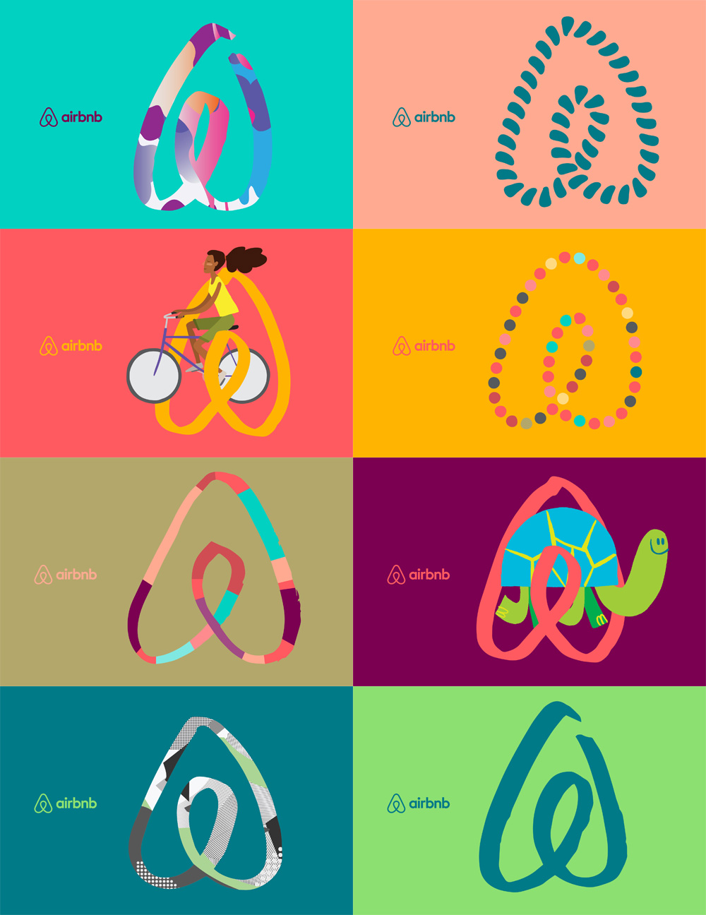 |
| Fig 1.3: Research (Airbnb Rebranding) |
 |
| Fig 1.4: Research ( Australian Opens Rebranding) |
 |
| Fig 1.5: Research ( Australian Opens Rebranding in flags) |
 |
| Fig 1.6: Research ( Australian Opens Rebranding) |
Process:
Week 5 (12/05/2020)
This is the first attempt on the project, I was a little confused about the project and creating the artwork
 |
| Fig 1.1: First attempt. |
 |
| Fig 1.5: 5th attempt. |
 |
| Fig 1.6: 6th attempt. |
 |
| Fig 1.7: 7th attempt. |
Week 7 (26/05/2020):
No class due to Hari Raya.
Process:
 |
| Fig 2.1: First attempt |
 |
| Fig 2.2: Second attempt |
 |
| Fig 2.3: Third attempt |
 |
| Fig 2.4: Other ideas |
Mr. Vinod chooses the first design and also instruct me on how to change it.
 |
| Fig 2.5: Finalizing |
 |
| Fig 2.6: Final attempt (B&W) |
 |
| Fig 2.6: Final attempt (colored) |
Feedback
Week 6:
General feedback:
Do more research about the topic that we choose and after we did our research start with a sketch then do it in illustrator.
do everything in black and white
Specific feedback:
It's the same feedback as the general feedback but in addition, after the sketch starts with finding the right typeface then begins with the illustrator.
Week 8:
General Feedback: Ask someone else to look at the key artwork if it's readable
After receiving feedback start to work immediately
Specific feedback:
Mr. Vinod demonstrated what to do, basically combining the design element
Pick a different color
Reflection
Experience: Week 6, After receiving the feedback from this week I felt quite discouraged, I didn't really sure on what to do for the project one, I felt I should've researched more and learn more about the project because I felt I wasted my time. Week 7, No class due to Hari Raya. Week 8, Mr. Vinod instructed us a new method to do the feedback session by using a Facebook comment, this works better in my opinion. It makes me not as nervous as the screen sharing on zoom and its quicker.
Observation: Week 6, It seems that most of the class is also struggling to do this project. To understand the topic of constructivism, Bauhaus and punk were quite difficult to understand, we need to do a lot of research to be able to work on the video beforehand. Week 7, No class due to Hari Raya. Week 8, It seems that after people do some research and understand more about the topic they have chosen, their work also improved a lot.
Findings: Week 6, After the feedback session, it was clearly a lot of others have some repetitive mistake on each other including me, it was important to not only learn a mistake from yourself but also others. Week 7, No class due to Hari Raya. Week 8, HARD Work does pay off, but those hard work will actually be useless and time-wasting if we did not learn from the previous to actually improve our work we need to do research and use all the lectures and the exercises that we have learned. It was a hard struggle bu to able figuring it out definitely worth it (if we get a good mark)
Further Reading
 |
| Fig 2.7: Typographic design Form n Communication 6ed by Rob Carter |

I'm having a hard time choosing the appropriate color for this project so, read the part about type and color.
Incorporating color into type significantly
affects legibility, using color and type must be taken with high consideration to achieve an appropriate contrast
between type and its background. A black
type on a white background is most legible.

When applying color to type, it should be
evaluated in relationship to the conditions
in which it is read. Especially in print, the conditions of screen resolution and
luminescence, as well as whether the type is
static or in motion, environmental communications, and also in
on-screen media such as the Internet.
Color has three main values; hue,
value, and saturation. Hue and
tone to simplify is specific names for color.
Value refers to the lightness or darkness of a
color, and saturation—also called chroma or
intensity—is the relative brightness of a color.


Comments
Post a Comment